Inflation Compass has the longest reconstructed history in BestFolio's September batch: 76.8 years, from January 1950 through October 2026. The standard card shows 17.16% annualized return, a 0.74 Sharpe ratio, 16.80% volatility, and a -36.38% maximum drawdown. Those numbers are useful, but the more important question is how a strategy built from modern ETFs can claim a history beginning in 1950.
The short answer is that it cannot. The rules can be reconstructed that far back, using point-in-time macro data and asset proxy chains, but nobody traded this exact ETF implementation in the 1950s. A long backtest should expand the set of market regimes we can inspect. It should not erase the difference between reconstructed evidence and a live record.
Where it sits in the September batch
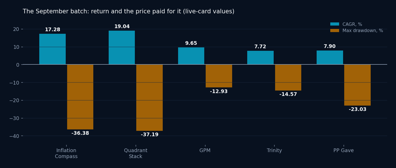
Inflation Compass shipped alongside 4 other strategies, and the batch is easier to judge as a set. Here are the 5 live cards side by side.
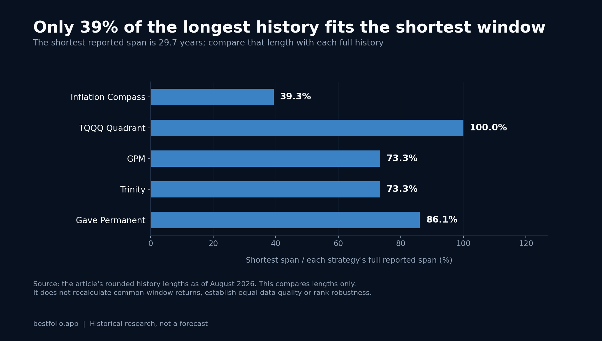
| Strategy | Since | Years | CAGR | Sharpe | Max DD | Volatility |
|---|---|---|---|---|---|---|
| Inflation Compass | Jan 1950 | 76.8 | 17.16% | 0.74 | -36.38% | 16.80% |
| TQQQ Quadrant Stack | Jan 1996 | 30.7 | 19.94% | 0.86 | -37.39% | 21.91% |
| GPM | Jan 1985 | 41.8 | 10.57% | 0.86 | -15.13% | 8.36% |
| Trinity | Jan 1985 | 41.8 | 8.45% | 0.70 | -14.57% | 7.46% |
| Permanent Portfolio (Gave) | Jan 1985 | 41.8 | 8.65% | 0.78 | -23.03% | 7.67% |
Correction, 12 October 2026: on 10 October 2026 BestFolio's GPM moved to Keuning and Keller's published rules, so its row now shows the current card (9.65% CAGR, 1.17 Sharpe, -12.93% maximum drawdown, 8.11% volatility; it was 9.20%, 1.13, -15.56% and 7.59%). The other rows are as published.
Correction, 13 October 2026: the synthetic history of GDE before its March 2022 launch now matches the fund's 90/90 exposure (90% S&P 500 and 90% gold futures), so the TQQQ Quadrant Stack row now shows its rerun card (18.48% CAGR, 0.91 Sharpe, -37.19% maximum drawdown, 22.28% volatility; it was 18.57%, 0.91, -37.72% and 22.43%). Its start and history length are as published.
Correction, 15 October 2026: volatility is now measured on observed prices, so months rebuilt from monthly data count at their month-end returns. The volatility column now shows 18.21% for Inflation Compass (was 14.63%), 8.25% for GPM (was 8.11%) and 7.64% for Trinity (was 7.41%); Permanent Portfolio (Gave) is unchanged. Also, the managed-futures history before KMLM and DBMF launched now uses the BTOP50 index, so TQQQ Quadrant Stack's card was rerun: 19.04% CAGR, 0.93 Sharpe and 21.90% volatility (was 18.48%, 0.91 and 22.28%), with the same -37.19% maximum drawdown. The other figures are as published.
The batch splits into 2 camps. Inflation Compass and TQQQ Quadrant Stack are the return engines, and they pay for it with -36.38% and -37.39% worst declines. GPM, Trinity, and PP Gave play defense: Trinity and PP Gave hold volatility below 8%, and GPM sits just above 8%. The Sharpe column, now measured above cash, tells a closer story: TQQQ Quadrant Stack and GPM share the top at 0.86, PP Gave follows at 0.78, Inflation Compass sits at 0.74 and Trinity at 0.70. The strongest CAGR in the batch ties the steadiest defender on risk-adjusted return rather than trailing it.
A 4-branch rule
Inflation Compass, inspired by David Varadi's work at CSS Analytics, makes 2 monthly decisions. It asks whether US equities are above their 200-day moving average. That is the growth signal. It also asks whether the inflation signal is active. The live implementation uses a 2% inflation threshold plus confirmation from either the recent direction of the 5-year breakeven rate or a sector-ratio trend.
The 2 decisions create 4 possible allocations. Growth with inflation holds energy. Growth without inflation holds technology. Contraction with inflation holds utilities. Contraction without inflation splits equally between consumer staples and intermediate Treasuries. The full portfolio therefore makes a concentrated macro choice once a month rather than blending all 4 regimes at once.
That concentration is why the result can look so strong and why the drawdown can still be severe. A wrong regime read does not merely trim a sleeve. It sends the portfolio toward the wrong corner of the map.
What the extra decades add
The deep-history research run was repeated from several start dates. The monthly reconstruction beginning in 1927 produced 15.25% annualized return, a 0.83 Sharpe ratio, and a -73.9% maximum drawdown. Beginning in 1950 improved those figures to 17.46%, 0.99, and -40.7%. A start in 2003 produced 22.96%, a 1.31 Sharpe, and an -18.0% drawdown.
That progression is a warning. A backtest beginning after the inflation shock, the early-1980s rate cycle, and several weak proxy periods makes the strategy look much cleaner. The additional history is not there to raise the return. It is there to force the rule through market environments that a modern ETF sample cannot contain.
The 1973 to 1982 inflation window was strong for the strategy: 19.8% annualized return with a 0.52 Sharpe ratio on the live card, versus 6.6% and -0.02 for US stocks (the 100% US Stock Market card), which earned less than cash's 8.7% a year over that decade. Yet the same long reconstruction contains a much harder episode. In that research run, the post-1950 worst drawdown began in 1983 and reached -40.7% before recovery in March 1993, about 9.5 years later. On the live card, which now includes the restored pre-1990 bond income, the same episode is -36.4% from February 1985 to a new high in May 1992, 87 months. An inflation-aware strategy can still suffer a lost decade.
The proxy chain is part of the model
The live signal uses the 5-year breakeven inflation rate where that series exists. Before 2003, the reconstruction uses point-in-time CPI information and older asset histories. It also lags the breakeven input by 1 day to avoid using a value that would not have been available when the allocation was set.
That conservative CPI proxy matters. In the overlapping period, the CPI-based reconstruction returned 16.6% annualized versus 22.8% for the breakeven implementation. The difference is too large to hide inside a footnote. It tells us the signal definition, not only the investment rule, contributes materially to the result.
Execution timing matters less, but it still has a measurable cost. Adding a 1-day delay reduced annualized return by about 0.4 percentage points in the research run. That is the kind of friction a monthly backtest can miss if it assumes every input and trade is available at the same timestamp.
How to read the card
I would use the 76.8-year result as a stress map. It shows that the rule encountered postwar inflation, disinflation, rate shocks, the dot-com decline, the financial crisis, and the 2022 stock-bond selloff. It also shows that the strategy can remain underwater for years even when its long-run average looks exceptional.
I would not read it as 76.8 years of investable live performance. The sector funds, the breakeven series, and the execution environment did not exist for most of the window. BestFolio's strategy page links the allocation logic to the reconstructed history so both can be inspected together.
The practical comparison is not whether 17.16% beats another card. It is whether the 4-branch mechanism still makes sense after you account for proxy choices, data timing, concentration, and the -36.38% daily path shown on the live card. The longest window gives us more ways to say no. That is why it is valuable.
Explore the Inflation Compass rules and full backtest.
Past performance does not guarantee future results. Backtested results are hypothetical and do not represent actual trading.