Someone read our flagship strategy page last week and left a verdict of exactly 2 words: "Overfitting masterpiece." No numbers, no argument. The instinct behind it is correct, though, and it deserves better than a defensive reply. Most published tactical strategies really are overfit. If you have spent any time looking at backtests, your scepticism is well earned.
So instead of arguing, we ran the tests that could convict us, and we are publishing what they found, including the parts that do not flatter us. This is the longest piece we have written. It has 5 sections: what overfitting actually is, why breaking is not always overfitting, what a real defence looks like, what our own strategy did under those tests, and what happened to 63 published strategies after their authors published them.
1. What overfitting actually is
Suppose you want a rule that tells you when to hold stocks. You look at history and notice that in the 6 years you examined, stocks did well whenever the third Tuesday of the month was sunny in Chicago. The rule fits your data perfectly. It also means nothing, because you found a coincidence in a small sample and mistook it for a mechanism.
That is overfitting in one sentence: fitting the noise instead of the structure. The trouble is that in finance the noise is enormous and the samples are small, so coincidences are easy to find and hard to distinguish from real effects.
It arrives through 3 doors, and only the first is usually counted.
The first door is parameter search. You have a rule with knobs: how many months of momentum to measure, how many assets to hold, how long a window to compute correlations over. You try many combinations and keep the best one. Every combination you try is a lottery ticket, and the winner will look good partly because it is good and partly because it got lucky. This door is at least countable: you know how many combinations you tried, even if you do not admit it.
The second door is researcher degrees of freedom, and it is far wider. Which assets went into the universe. Which start date the backtest uses. Whether costs are modelled at 5 basis points or 25. Whether a leveraged fund is simulated or dropped. None of these feel like fitting while you do them, because each choice has a reasonable justification. They are still choices, and choices respond to results.
A reader put this to us more sharply than we would have put it ourselves, and he was right:
How many degrees of freedom are there? Are you counting the "k" in top k performers? How about the "j" in bottom j correlated? Forget that. How about you look at the researcher degrees of freedom. Run the combinatorics on n choose m with n possible global assets and m=14.
He is pointing out that the number of possible 14-asset universes is astronomically large, so a strategy could be fitted through the choice of universe while every visible parameter looks untouched. We answer that objection with a measurement in section 4, rather than with a rebuttal.
The third door is the one nobody can close: you only ever see the survivors. Strategies that failed early were never written up. The published record is a highlight reel, and every reader of it, including us, is drawing conclusions from a sample that was filtered before it reached them.
Why tactical allocation is unusually exposed
A monthly tactical strategy running since late 1988 makes roughly 450 decisions. The backtest requests prices from 1987, but usable return history begins on 30 November 1988 for the Triplet and the S&P 500 and on 31 March 1989 for HFEA, so every window below is labelled by the requested range while the measured record is 37.7 years. That sounds like a lot of evidence. It is not. The decisions overlap heavily, most months are uneventful, and the outcome is dominated by behaviour during a handful of stress episodes: 2000 to 2002, 2008, March 2020, 2022. In effect you have maybe 5 or 6 genuinely independent tests of whether the defensive machinery works.
Meanwhile the strategy has 4 or 5 knobs, each with a plausible range. The ratio of things you can adjust to independent events you can check is dreadful, and it is far worse than in, say, equity factor research where a cross section of thousands of stocks provides real breadth.
Then comes the asymmetry that makes the whole problem hard: an overfit backtest and a genuine edge look identical in-sample. Both show a smooth equity curve and a flattering Sharpe ratio. There is no test you can run on the fitting sample that separates them, because the fitting sample is exactly where they agree. Everything useful happens outside it.
2. Not everything that breaks was overfit
"It stopped working" and "it was overfit" get used as synonyms. They are different diagnoses with different remedies, and confusing them means running the wrong test.
There are 3 distinct ways a strategy that looked good stops being good.
Overfitting. The pattern was noise. It fails immediately outside the sample, because there was never anything there. A strategy with 20 hand-tuned conditions that reads like a list of exceptions is usually this.
Regime dependence. The pattern was real, but it rested on a structural relationship that was itself temporary. This one works for years or decades and then stops when the structure changes. It is not noise, and no amount of parameter discipline protects you from it.
Implementation decay. The edge is real and persists, but costs, taxes, capacity or a fund closure eat it. The rules still work on paper and not in your account.
The case that separates them: HFEA
HFEA, for anyone who has not met it, is a strategy that got enormously popular on Reddit around 2020: hold 55% of a 3x leveraged S&P 500 fund and 45% of a 3x leveraged long Treasury fund, rebalance every quarter. The reasoning was that stocks and long bonds had moved in opposite directions for decades, so the bond leg would cushion the equity crashes while leverage magnified the recovery.
We ran it through our engine on the same window we use for everything else.
| Window | CAGR | Volatility | Sharpe | Sortino | Max drawdown |
|---|---|---|---|---|---|
| 1987 to 2026, full | 16.98% | 28.6% | 0.70 | 1.09 | -66.8% |
| 2010 to 2021, the golden era | 34.77% | 1.49 | -43.9% | ||
| 2022 alone | -60.54% | -1.36 | -64.8% | ||
| 2022 to 2026 | -3.21% | 40.3% | 0.12 | 0.17 | -61.6% |

Now the important part. HFEA has essentially no parameters. 2 funds, 1 weight, 1 rebalancing frequency. There is almost nothing to fit. By the usual folk rule that simple strategies are safe and complicated ones are suspect, HFEA should have been among the most robust things anyone could own.
It lost 60% in a single year.
What broke was not a fitted parameter. It was the assumption underneath: that long Treasuries reliably rise when equities fall. That relationship held for roughly 40 years, and it was real while it held. In 2022 inflation returned and both legs fell together, and 3x leverage on both sides of a portfolio that was no longer diversified did exactly what leverage does.
The 55/45 split is worth a second look too. It was not arbitrary. It was chosen because it performed well in the backtests available at the time, and those backtests were dominated by the bond bull market. So the fitting that occurred was not knob-fitting on noise. It was fitting to a real regime that was assumed to be permanent.
The lesson we take from HFEA is the opposite of the folk rule: simplicity is not safety. A simple strategy resting on one structural assumption is more fragile than a complicated one resting on several weak, independent ones. What matters is not how many parameters a strategy has, but how many separate things have to stay true for it to keep working.
The case that really is overfitting
For contrast, here is one from our own rejection log, which is the public list of strategies we tested and declined to endorse. A reader sent us a leveraged strategy that had been circulating on a strategy-sharing site: hold a 3x Nasdaq fund when any of roughly 20 hand-picked combinations of moving averages, momentum readings and an RSI threshold say the Nasdaq is in an uptrend, otherwise hold long Treasuries. Its published growth chart was worth almost 4,000%.
The backtest began in late 2009, at the bottom of the financial crisis. It had never been tested through a technology crash, which is the one event that matters most for a 3x Nasdaq position.
We rebuilt the rules and ran them back through the dot-com bust. Stripped to their honest core, they drew down 93%. The 20 tuned conditions were not robustness. They were a list of the specific ways the last 15 years happened to unfold.
That is what actual overfitting looks like: many conditions, a short and flattering window, and a catastrophic result the moment you extend the sample.
3. What a real defence looks like
There are 6 tests worth running. None of them proves a strategy is sound. Each one can convict, and a strategy that survives all 6 is merely not yet convicted. That is the most any of this can deliver, and anyone promising more is selling something.
| Test | What it catches | What it misses |
|---|---|---|
| Parameter surface | Results balanced on one lucky setting | Anything fitted through the universe or the window |
| Holdout period | Fitting to the visible sample | Nothing, if the author saw the holdout before choosing |
| Deliberate cherry-pick | Calibrates how much winning a search is worth | Says nothing about this strategy specifically |
| Universe perturbation | Edges that live in the asset list, not the rules | A pool that is itself curated |
| Statistical haircut | Prices the search you admit to | Every search you do not disclose |
| Live forward record | Everything, eventually | Nothing, but it is unbearably slow |
The last one is the only test that cannot be gamed, and it is the reason this field moves so slowly. A live record needs years before it says anything, and by then the market regime has changed and the argument starts over.
4. Our own strategy, put through all 6
The strategy under examination is our Momentum-Correlation Triplet. Each month it scores 14 global asset classes on momentum averaged over 3, 6 and 12 months, keeps the top 5, then selects the 3 of those 5 that moved least alike over the previous 252 trading days, equally weighted, with a cash filter when nothing is trending. On its strategy card, from October 1987, it compounds at 14.60% with a Sharpe of 0.97 above cash and a worst drawdown of 17.7%. The study below reran it on usable history from November 1988, where it returns 14.75% with a Sharpe of 1.24, measured above zero like every Sharpe in the study's own tests.
Before the tests, 2 admissions, because they change how you should read everything after them.
Admission 1. The parameters were chosen by judgement in 2019, and we cannot prove that to you. There is no timestamped public record of the 2019 rule set. Everything since 2019 is therefore out of sample by our account of events, and you have only our word for the date. Treat it as a claim, not as evidence. The only fully verifiable forward record starts in February 2026, when we began publishing timestamped monthly signals, and 8 signals is not a track record.
Admission 2. When we finally did run a sweep, as an audit for this article, our published configuration came out 2nd best of 700. That is what a fitted parameter set looks like from the outside. The rest of this section is about whether that ranking means what it appears to mean.
Test 1: the parameter surface
We ran 700 configurations, varying the momentum lookback set, how many assets are ranked, how many are held, and the correlation window. Each one is a full backtest from 1987 to 2026.

The published configuration ranks 2nd of 700 on CAGR (14.75%, against a median of 11.42% and a best of 15.03%) and around 11th on Sharpe, where rounded rows contain ties so the exact position is an ordering convention. We are not going to pretend that is a neutral position. Anyone looking at that number alone should conclude the parameters were tuned.
3 things complicate that conclusion.
The first is that the grid is centred on our values, so the comparison set is by construction a neighbourhood of our choice rather than a random sample of possible strategies.
The second is that the configuration that came 1st is not ours. Using momentum over 1, 3, 6 and 12 months instead of 3, 6 and 12 returns 15.03% against our 14.75%. If we had been maximising, that is what we would have shipped. Every value we do use is a convention rather than a fitted quantity: the 3/6/12 blend is standard in the dual momentum literature, 252 days is a year, and 5 then 3 are round numbers. Fitted parameters tend to look like 4/7/13 months and 189 days.
The third is the local surface. Of the 19 configurations that differ from ours on exactly one axis, all 19 still work: CAGR from 10.6% to 15.0%, Sharpe from 0.97 to 1.25. The median neighbour gives up 1.38 percentage points of CAGR and the worst gives up 4.11. There is no cliff. Nothing about the result depends on landing exactly where we landed.
Test 2: the holdout, and what the design date is worth
If the strategy was designed in 2019, then 1987 to 2018 is the data its designer could see, and 2019 to 2026 is data he could not. Splitting there:
| Window | CAGR | Sharpe | Max drawdown | Rank among the 700 |
|---|---|---|---|---|
| 1987 to 2018, before the design | 14.34% | 1.19 | -17.5% | 3rd |
| 2019 to 2026, after it | 16.36% | 1.42 | -12.9% | 58th |
Read the last column before the others. Our configuration was 3rd best of 700 on the data available at design time, and 58th on the data that came after. It stayed in the top 9%, which is a respectable result, but it plainly regressed toward the pack.
That regression is the finding, and it generalises. Across all 700 configurations, the correlation between performance before 2019 and performance after 2019 is -0.006. Which configuration looked best on 31 years of history told you nothing whatsoever about the next 7.7 years.
There is a second half to that result which matters more for the strategy than the first half does. Every single one of the 700 configurations delivered a CAGR above 10% after 2019, and 692 of them had a Sharpe above 1.0. The distribution runs from 10.18% to 18.96%, with a median of 14.09%.
So the parameters barely matter, in both directions. Choosing well beforehand bought nothing, and choosing badly cost surprisingly little. Whatever this strategy has, it lives in the structure, which is momentum ranking followed by correlation-based selection followed by a cash filter, and not in the specific numbers plugged into it. That is a far better answer to the degrees-of-freedom objection than a plateau argument: if the degrees of freedom do not change the outcome, they are not where the fitting happened.
One caveat, stated plainly: the period after 2019 was kind to this whole family of strategies, with a median CAGR of 14.09% against 10.77% before. The levels are flattered by the era. The correlation of -0.006 is the robust part, because it compares configurations to each other inside the same period.
And against the obvious alternative
A fair question at this point is whether any of this beat simply buying the index. On raw return since 2019, no, and that comparison is close to meaningless: a strategy that holds bonds and gold much of the time will lose a pure-equity race during an equity bull market, and the gap tells you about the period rather than the rules. The comparison worth making adjusts for how much risk each one took.
| 2019 to 2026 | CAGR | Volatility | Sharpe | Sortino | Max drawdown |
|---|---|---|---|---|---|
| Momentum-Correlation Triplet | 16.39% | 11.1% | 1.42 | 2.74 | -10.5% |
| S&P 500 | 16.47% | 16.4% | 1.02 | 1.69 | -23.9% |
| HFEA | 13.30% | 37.0% | 0.52 | 0.81 | -66.8% |
That table starts at the end of January 2019 and therefore leaves January itself out. Aligned to whole calendar months from January 2019 through August 2026, the S&P 500 leads by 1.08 percentage points, 17.45% against the Triplet's 16.37%, with HFEA at 15.01%. The returns are not tied, and everything else still differs. The Triplet reached the same place with 2 thirds of the volatility, less than half the peak-to-trough loss, and a Sortino ratio of 2.74 against 1.69. Over the full 37.7 years of usable history the gap is wider on every measure: 14.75% against 11.35%, Sortino 2.25 against 1.27, worst drawdown 12.2% against 50.8%.
Sortino is the more revealing of the 2 ratios here, because it only counts downside movement. HFEA is the clearest case: 16.98% a year over the full period sounds excellent until you see a Sortino of 1.09, which says almost all of that return was payment for downside risk rather than anything else.
Drawdowns in this table are measured on month-end values so that all 3 are on the same basis, which is why the Triplet reads -10.5% here and -17.7% on its strategy page, where the full daily series is used.
Test 3: cheat deliberately, then measure the bill
The cleanest way to learn what a fitted result looks like is to produce one on purpose. We took the same 700 configurations, ranked them on 2010 to 2021 only, took the winner, and then looked at what it did from 2022 onward. The published configuration goes along for the ride as a control.
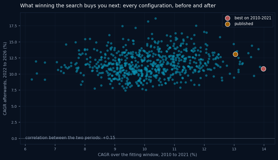
| 2010 to 2021 (the fitting window) | 2022 to 2026 (afterwards) | |
|---|---|---|
| The winner of the search | 13.98% | 10.80% |
| Our published configuration | 13.04% | 13.10% |
| Average of the top 10% of the search | 12.54% | 12.14% |
| Average of all 700 | 11.59% |
The winner of the search lost 3.2 percentage points when the music changed. The configuration that had not been selected on that window held its level. Winning the entire search was worth less than nothing afterwards. The winner returned 10.80%, below the 11.59% average of all 700, so picking at random from the same family would have done better. The 12.14% belongs to the top decile of the fitting window, not to the configuration that won it.
The correlation between the fitting window and the following period, across all 700, is +0.15. Better than the -0.006 we found across the design date, and still close enough to nothing that you should not pay for it.
This is the number we would most like readers to take away, because it applies to every backtest anyone shows you, not just ours. When someone presents the best configuration out of many, the thing that made it the best is mostly not repeatable.
Test 4: is the universe the hidden fitted parameter?
Back to the objection from section 1. If the asset universe is a degree of freedom, the strategy could be fitted through it while every parameter looks clean. This is testable in 2 ways.
Drop each asset in turn. If one asset is carrying the result, removing it should collapse the strategy. Removing each of the 14 in turn leaves CAGR between 11.43% and 14.90%, and Sharpe between 1.06 and 1.25, against 14.70% and 1.24 for the full set. The most load-bearing single asset is the Nasdaq proxy, whose removal costs 3.3 percentage points of CAGR. Nothing collapses.
Draw random universes. We built a pool of 31 liquid asset-class funds and drew 60 random 14-asset universes from it, running the identical rules on each.
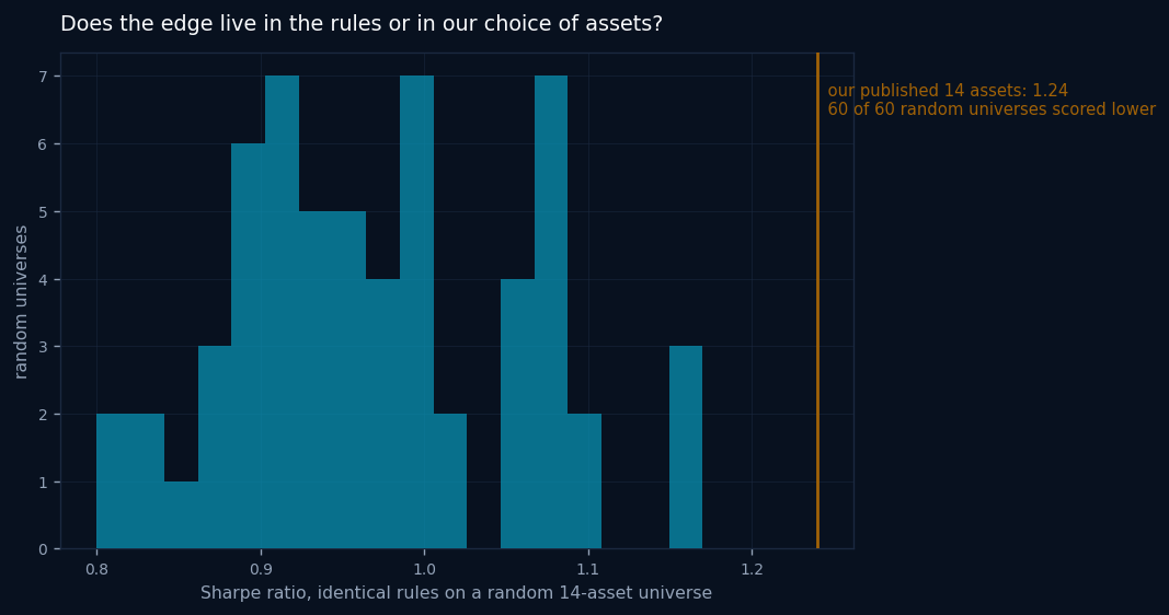
The random universes produce a median Sharpe of 0.96, with 18 of 60 above 1.0. So the rules work on asset lists we did not pick, which is the robustness claim. But none of the 60 beat our 1.24, and that deserves to be stated as plainly as the good news: our universe is worth roughly 0.28 of Sharpe over a random draw, and it is a real degree of freedom that we exercised. The honest summary is that the machinery does the heavy lifting and the universe adds a genuine, measurable increment on top. The critic was right that it counts. It is simply not where the whole result comes from.
Test 5: the statistical haircut
If you test enough strategies, one of them looks brilliant by chance. The deflated Sharpe ratio, from Bailey and Lopez de Prado and set out in full on our methodology page, prices that directly: it asks how impressive a Sharpe ratio is given how many candidates were examined to find it, how long the track record is, and how ugly the return distribution is.
Our catalogue currently scores 279 variants (every variant with a stored backtest, except single-ETF holds). At the spread of Sharpe ratios we actually observe across them, the best result you would expect from pure luck alone has an annualized Sharpe of 0.53, measured above cash like the Sharpes on our cards. That is the bar any single strategy has to clear before its number means anything.
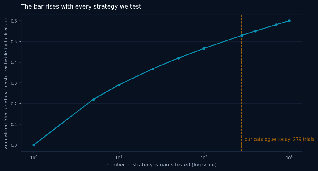
That curve has an uncomfortable implication we accept deliberately. Every strategy we add to the catalogue raises the bar for all the others: at 279 trials the luck benchmark is 0.53, and at 1000 it would be 0.60. Most vendors never pay this penalty, because they only count the strategies that worked.
Track length matters at least as much as the raw number:
| Length of record | Sharpe needed to score 0.90 | To score 0.95 | To score 0.99 |
|---|---|---|---|
| 5 years | 1.19 | 1.40 | 1.84 |
| 10 years | 0.98 | 1.12 | 1.40 |
| 20 years | 0.84 | 0.94 | 1.12 |
| 37.7 years | 0.76 | 0.82 | 0.95 |
A Sharpe of 1.24 scores 0.9999 on a 37.7-year record and only 0.9145 on a 5-year one. This is the single most useful thing in the whole framework for a reader: when someone shows you a 5-year backtest with a Sharpe of 1.4, they have shown you roughly the same evidence as a 38-year backtest with a Sharpe of 0.82.
We also publish the failures this produces. On the leaderboard, 101 of our 201 variants are flagged fragile, meaning they score below 0.90, and they stay visible with the flag rather than being quietly removed.
Test 6: the live record
We began publishing timestamped monthly signals for this strategy in February 2026. That is 8 signals. It proves nothing yet, and it is the only evidence here that cannot be manufactured after the fact. In 5 years it will be the only section of this article worth reading.
5. What happens to published strategies after they are published
Everything so far examines 1 strategy. The more useful question is what happens to tactical strategies in general once their rules become public.
In equity research this is settled ground. McLean and Pontiff found that documented stock-market anomalies decayed by roughly half after publication, some because arbitrage removed them and some because they were never as strong as the original paper suggested. Nobody, as far as we know, has asked the same question of published asset-allocation strategies.
We can, because our catalogue records a verifiable publication date and a source citation for each strategy: an SSRN posting, a blog post, a book. We ran each strategy's rules over its full available history, split the record at its own publication date, and compared the halves. 63 strategies had enough history on both sides.
First, a result we do not believe
Measured against the S&P 500, the picture looks catastrophic. Before publication, 41% of these strategies beat the index. After publication, 1 of 63 did. Median excess return falls from -0.6 to -6.1 percentage points a year.
We are not publishing that as a finding, because it is almost certainly an artefact. Most of these publication dates fall before the 2010 to 2026 US equity run, so the "after" windows sit inside the period when almost nothing diversified beat the S&P 500, while the "before" windows contain 2000 to 2002 and 2008, when defensive strategies shone. A low-volatility strategy would produce exactly this pattern with no decay at all. Presenting it as evidence would be the same error this article is about.
The measurement that survives the era
The fix is to stop comparing each strategy to the index and start comparing it to its own peers over the identical calendar window. A market regime lifts or sinks everything together, so it cancels. Only relative standing survives.
For each strategy we take the 7 years before its publication and the 7 years after, compute its Sharpe ratio in each, and convert that to a percentile rank against every other catalogued strategy measured over the very same 2 windows.
| Measure across 63 published strategies | Before publication | After |
|---|---|---|
| Median percentile rank among peers | 56.5 | 35.5 |
| Median Sharpe ratio | 0.98 | 0.67 |
41 of the 63 fell in the rankings, 22 rose, and 27 fell by more than 20 percentile points. Individual cases are stark. Faber's Global Tactical Asset Allocation went from the 98th percentile before its 2006 paper to the 32nd after. Keller and van Putten's Flexible Asset Allocation went from the 94th to the 2nd. The Ivy Portfolio went from the 71st to the 3rd.
And the control that stops us overclaiming
There is still a problem, and it is the same one that traps everyone who studies this. Strategies get published because they look good. The big fallers above were at the 93rd to 98th percentile beforehand. Anything at the 98th percentile falls next period, publication or not. That is regression to the mean, and without a control group we would simply be rediscovering arithmetic.
So we built one. For each published strategy, we found peers that had a similar percentile rank at the same date and were not published within 3 years of it, and measured what those peers did over the identical following window. If publication does nothing, the published strategy should fall by about as much as its matched peers.
| Across 60 strategies with matched controls | Change in percentile rank |
|---|---|
| The published strategies | -8.9 |
| Their rank-matched peers, same windows | -0.8 |
| Difference (the part publication might explain) | -18.1 median, -10.2 mean |
36 of the 60 did worse than their matched peers, and 24 did better.
Now the honest statistics, which point 2 ways. A sign test, which counts only direction, does not rule out chance: a 60/40 split is too close. A Wilcoxon signed-rank test, which also accounts for how large the moves are, leans the other way, because the falls are much bigger than the rises. A bootstrap confidence interval for the median difference includes zero. We have withdrawn the exact p-values and interval bounds pending a rerun from the unrounded rows; the direction of each test is unchanged.
The correct conclusion is that the evidence leans toward real post-publication decay in tactical allocation, and 60 strategies are not enough to establish it. We would rather write that sentence than the headline it could have been.
What we would say with more confidence is the practical version, which does not depend on the significance test: a strategy you find sitting near the top of any ranking is unlikely to stay there, whether or not publication is what moves it.
6. What none of this proves
6 tests, 1 strategy that survived them, and a catalogue-wide result that leans one way without settling. It is worth being exact about what remains unresolved.
These tests bound the damage, they do not establish an edge. Every one of them is capable of convicting and none is capable of acquitting. The Triplet was not convicted. That is all.
Our 2019 design date is unverifiable, and it carries a lot of weight in section 4. If you disbelieve it, that section reduces to a parameter surface and a statistical haircut, and you should discount it accordingly.
Our catalogue is itself a selection machine. We chose which strategies to implement. The decay study's "before publication" numbers are biased upward by exactly that, since a strategy nobody found interesting never got catalogued.
The strategies in the decay study are our implementations of other people's rules. Where an author was vague, we made a judgement call, and our version may be better or worse than what they intended.
The period since 2019 flattered this entire strategy family, ours included. Read the relative results, not the levels.
7. How to run these tests on anything you are shown
Most of this does not need our engine. If someone shows you a tactical strategy, these questions are enough to place it.
When was the backtest's start date chosen, and what happens 10 years earlier? A strategy that starts in 2009 or 2010 has never seen a technology crash or a rates shock. This single question kills more strategies than any other.
How many things had to be decided to produce this? Count the parameters, then count the invisible choices: the universe, the costs, the rebalancing day. Ask which were tried and rejected.
What happens 1 step away from every stated parameter? If the author cannot tell you, they have not looked, and if the answer is a cliff, the result is balanced on a coincidence.
How long is the record, and how many strategies were examined to find it? A Sharpe of 1.4 over 5 years is weaker evidence than 0.85 over 39 years. Anyone who has tested 200 ideas needs to clear roughly 0.51 before their best result means anything.
Which single assumption has to stay true? HFEA needed 1 thing: that long bonds rise when equities fall. Ask what the equivalent sentence is for whatever you are being shown, and then ask how you would know if it had stopped being true.
Is there a live, timestamped record, and how long is it? Everything else can be constructed after the fact.
Our own answers, for the record: the parameters were chosen by judgement in 2019 and we cannot prove the date; 700 configurations of the same machinery all clear 10% CAGR after 2019 and their pre-2019 ranking predicts nothing about it; the universe contributes about 0.28 of Sharpe and no single asset in it is load-bearing; the robustness score on its card is 0.995 on a 39-year record against a luck benchmark of 0.53 at 279 trials; and the live record is 8 monthly signals, which is nothing yet.
The strategy pages carry the underlying numbers, the rejection log carries the strategies that failed these tests, and the fragile flag stays visible on the 101 variants of our own that score below the cutoff.
Correction, 18 October 2026: the catalogue figures in Test 5, the summary and the Triplet's card figures are updated to the current leaderboard. Sharpe and UPI are now measured above cash, see the changelog: most Sharpes fell, so the luck benchmark is lower (0.53 at 279 trials) but many more variants score below the 0.90 cutoff. The track-length table and the scores quoted with it were recomputed with the same deflated Sharpe code on these inputs. The study's own backtests and their Sharpes, measured above zero, are unchanged.